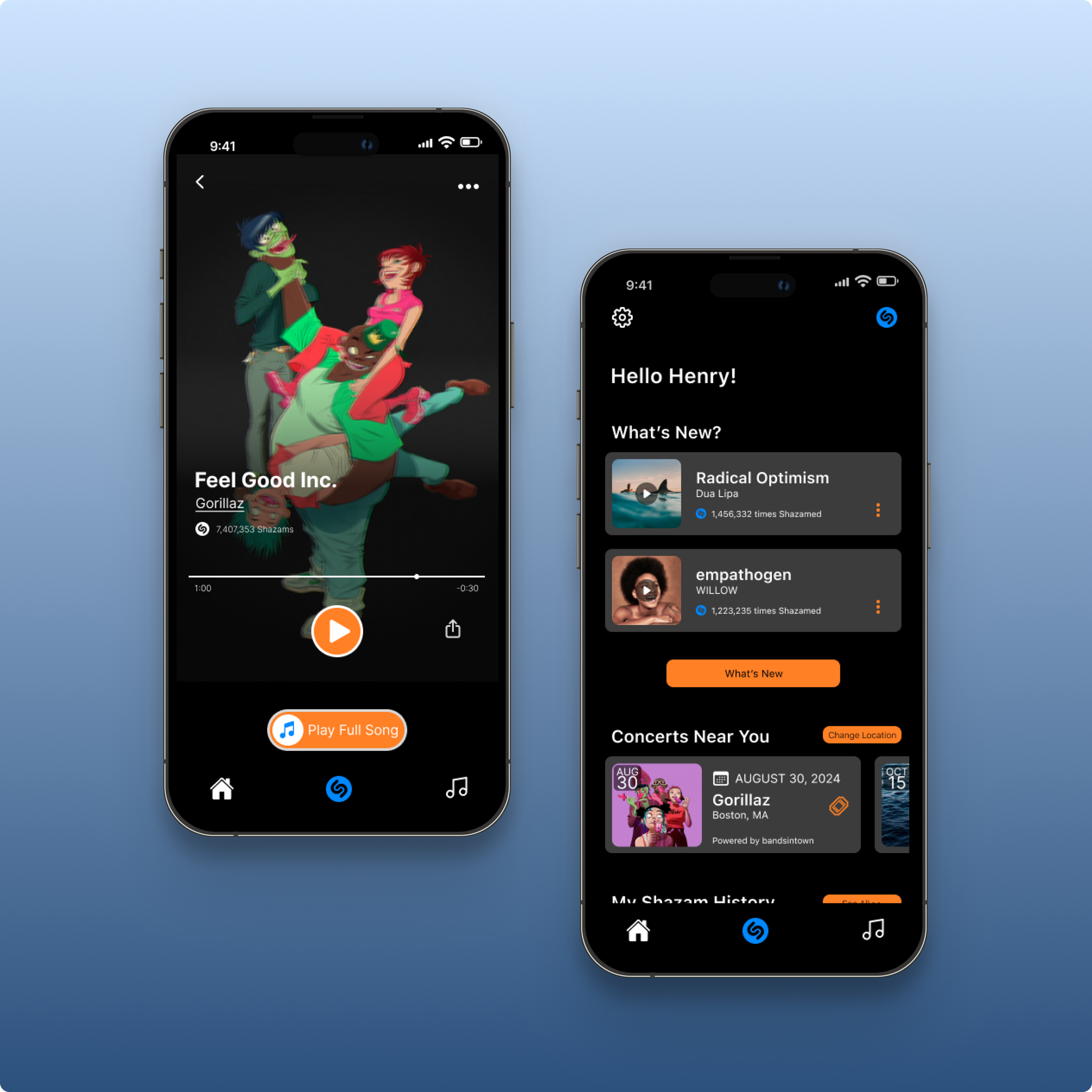
Locking in listeners through sleek, user-friendly interfaces and innovative ways to discover their next favorite song.
Shazam.
Brief.
Creating compelling concepts and innovative strategies to bring in new listeners while inspiring and fostering an engaged music community.
Key Skills.
Figma
UI/UX Design
User ResearchUser Testing
Concept & Objective.
Shazam faces user retention challenges post-song identification. Users typically exit the app after discovering new tracks, limiting engagement. Our project focused on developing innovative features to extend user sessions and enhance in-app interaction, transforming Shazam from a simple song identifier into a comprehensive music exploration platform, staying within their business goals and limitations.
Information.
Role: Design Lead
Duration: Two weeks
Category: UX Design, UI Design, Prototype
The Challenge.
Increase user retention on Shazam's app while aligning with the company's business objectives and technical capabilities.
The Solution.
Designed intuitive user flows which start with push notifications and alerts to surface new music discoveries, friend’s listening habits, and music rediscovery based off of location.
Discover.
Interviewing music lovers from across the United States.
User Interviews.
Conducted user interviews with 6 users. Users were all based in different parts of the United States with ages ranging between 28 and 38 years old. Each user currently uses Shazam and are music fanatics, interested in all sorts of genres of music.
Our discoveries had shown us that users prioritized song discovery and the accessibility for musical playlists of sorts.
Users had expressed that music discovery is important to them all in order to find new music.
““I find it a bit daunting to go looking for new music. So if someone prompted me to discover new music, then I will. ””
““I use the notifications to find new songs. I will also find songs dependent on my mood.””
““When I follow my friends in Spotify, I can explore new songs that they are also listening to and might take interest in them as well.””
Another step to finding the solution.
Problem Statement.
Henry is disinterested with his current music taste and needs a way to discover new music and be able to share his findings with his friends without switching between multiple apps.
How Might We’s.
How might we implement personalized notifications and reminders within Shazam to prompt users like Henry to discover, save, and share new songs based on their preferences and past interactions with the app?
How might we leverage location-based features within Shazam to recommend new songs and playlists based on users' current location or past check-ins, adding a contextual element to music discovery and enhancing user engagement?
How might we redesign Shazam's user interface to make the process of discovering, saving, and sharing new songs more intuitive and seamless for users like Henry, reducing the need to switch between multiple apps?
Sketch illustrating how we might design the history page.
Design.
For our stakeholders, we present to you, Henry.
Persona.
The persona, Henry, was created based off of our user interviewees. Everyone we had interviewed were in between the ages of 28 and 38 years old and are young professionals.
Discovering that life has ups and downs.
Journey Map.
The journey map shows Henry’s emotional state throughout the user flow’s happy path. The path shows that Henry is sent a push notification about a song that he had previously Shazamed. With music discovery being the most important aspect for our users, we created a feature where you can rediscover songs based off of location. As we continue into the journey map, we can understand that rediscovering music can be just as exciting as if finding new music. We just add the emotion of nostalgia.
Following the music lovers happiest path.
User Flow.
This project required two user flows. Flow 1 outlines Henry's journey from receiving a personalized push notification about his friends' music interests, exploring those songs to opening the full song on Spotify. The process includes:
Receiving an alert about friends' music activity
Viewing a curated feed of friends' listening habits
Selecting a song from a friend's activity
Exploring the artist's page
Discovering additional tracks by the artist
Transitioning seamlessly to Spotify for the full song
Friend’s music history page.
Push notification for users to discover music via their friend’s activity.
Flow 2 illustrates Henry's process of rediscovering and sharing a previously Shazamed song based on location:
Accessing the map feature within the Shazam app
Locating the specific place where he originally identified the song
Retrieving the forgotten track from the location-based history
Sharing the rediscovered song with his friends
Find previous Shazamed songs by location.
Open the map to find where you were when the song was discovered.
Locking in a organized system, making sure everything stays in tune.
Design System.
Where simplicity meets sound. Our sleek design strips away clutter, letting your music take center stage. Intuitive navigation and seamless transitions create a fluid music discovery experience. With a minimalist aesthetic and cohesive color palette, the Shazam app offers a visually pleasing journey through your audio world. Every element serves a purpose, ensuring your focus remains on what matters most—the music.
Components.
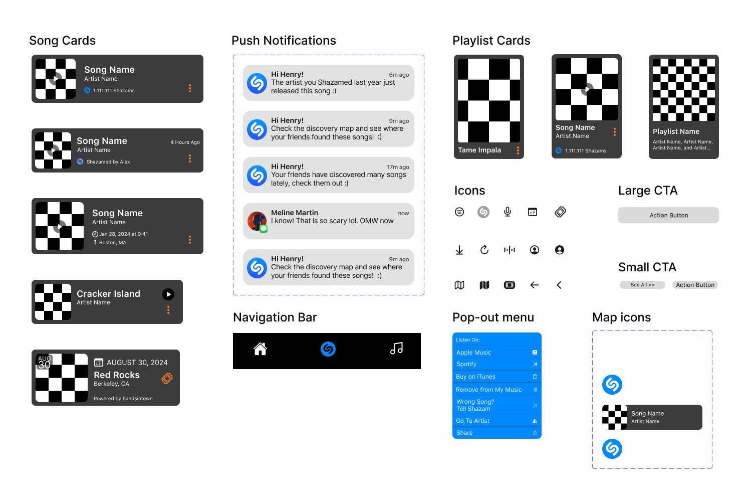
As our design evolved, we developed content cards for each element, maintaining a clean and cohesive aesthetic. By storing all components in our library, we ensured consistency throughout the project.
Color.
For color, I chose true black, the Shazam blue, orange, and gray. The primary color is black, the secondary is orange, and the tertiary color is the Shazam blue. For the dark mode design, we employed dark gray for playlist and song cards, creating contrast against the black background.
Typeface.
We decided to continue with the typeface Shazam originally used. We wanted a typeface that is clear and readable and to also follow Shazam’s business requirements. Being a company owned my Apple, SF Pro was decided on to keep cohesiveness within the design.
Wireframes.
Each wireframe was structured to offer sleek design, easy and usable function, and organization. As the design lead, I wanted to consider creative design but to use what has been proven to work. Inspiration from Shazam and Spotify, song cards were created. We created song cards that look familiar so users would know how to use the app easily without having to learn something new and to prevent confusion.
Putting it all up to the task.
Usability Testing.
Conducted 3 usability tests with users who are music fanatics and Shazam users.
Users were based in Colorado, California, and Kentucky, ages were between 28 years old to 37 years old.
100%
Usability Tasks:
User Goal 1:
Henry tried to find a song that he previously Shazamed in North End, Boston. After he finds it, he needs to make sure that it is the right one and to share with his friend, Emilio.
of the users were able to successfully complete each task without errors.
Observations:
Each user selected the icon “Shazams” when asked to go to the history page. We gave users the ability to access this music history in two ways.
Prompt 1:
Task 1: Can you open the app and go to the shazam's history?
Task 2: Can you find the area North End above Boston Downtown and zoom in?
Task 3: Can you now find the Shazam icon button next to Carmelina’s restaurant near the Paul Revere’s house and select the song?
Task 4: Try to share it via text message to Emilio, please.
Prompt 2:
Task 1: Can you click on the push notification that mentions your friends music history?
Task 2: Can you now select the song Feel Good Inc. and open it on Spotify?
User goal 2:
Henry had received a push notifications telling him to check out his friend’s music activity. Henry needs to to look at their music. After finding a song he likes from a similar artist, Henry will open in Spotify..
100%
of the users were able to successfully complete each task without errors.
Observations:
50% of the users found the “Play full song” button confusing. We can understand that due to the lack of color it could have been a misleading CTA.
Shazam’s friend’s history song cards and option selection for for each song.
Illustrating how to find Shazamed songs based off your previous locations.
Delivery
Final Mockups.
As our project came to a final, we delivered 10 mobile mockup pages consisting of a lock screen with push notifications, a landing page, home page, friend’s history page, personal history page and more.
Push Notifications.
Home Page.
History Page.
Artist Page.
Landing Page.
Friend’s History Page.
Map Page.
Song Page.
Key Takeaways.
Next Steps.
To continue to find innovative solutions to keep users engaged and to make music discovery constantly exciting and new.
Integrate a social networking feature into Shazam's app to boost user engagement, increase song discoveries, and improve retention rates.
To gamify song discovery to help increase and retain users globally.
Thank you!
Thank you for taking the time to view my work. Interested in what I’m doing? Let’s chat!
Please reach out at kira.lazickas@icloud.com


